-
Oops! there is no product in your cart.
Color Tips
Graphic Design Color Tips for Custom Printed Marketing Displays
For best graphic printing results here are some some basic tips on CMYK Color Conversion, Color Matching, Rich Black, True Blue and Gradient Banding. If you need help please feel free to call our graphics department at 239-433-9738, we want you to get the best print possible for your marketing display project!
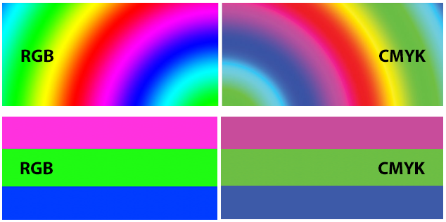
CMYK vs. RGBPlease convert all colors to CMYK before submitting art. Large format printers are only able to print in CMYK inks. All files that are setup in RGB color format will be converted to the CMYK color format. There is a chance that a color shift may occur when converting the color formats and may not be as vibrant as the RGB format. We can not accept financial responsibility for color shifts if you submit RGB files, thank you for understanding.
The image below is a comparison of RGB versus CMYK color gamuts. The CMYK color gamut is much smaller than the RGB color gamut, thus some CMYK colors will look muted.
|
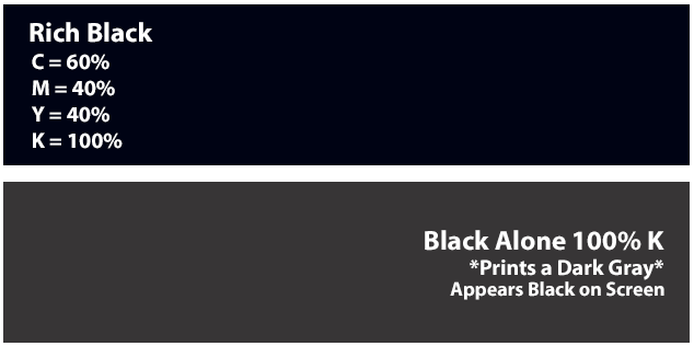
Rich BlackRich black is an ink mixture to create a solid black when printed. Which is created with a four color build of C-60%, M-40%, Y-40%, and K-100%. This will result in a darker tone than black ink alone. If you print black alone as 100% K, the resulting black may appear washed out on the final piece.
|
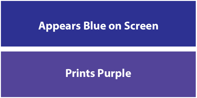
True BlueWhen looking at the CMYK spectrum you will see that blue is closer to purple. Remember, use a low amount of magenta whenever using high amounts of cyan to avoid purple. When using a blue in your design, always make sure to leave at least a 40% difference in your Cyan and Magenta values. Example: C-100 M-60 Y-0 k-0
|
GradientsA gradient is the process of blending two or more colors to create a transition in colors. Banding can occur when the transition between colors is not smooth, which can create patterns of vertical lines. This can be very visible when making color transitions from dark to light. One method to correct the issue is to add additional transition color that is close to a medium tone of the two colors. This will help the transition appear smoother. Another way would to add an effect to the gradient to help the colors blend together.
|


